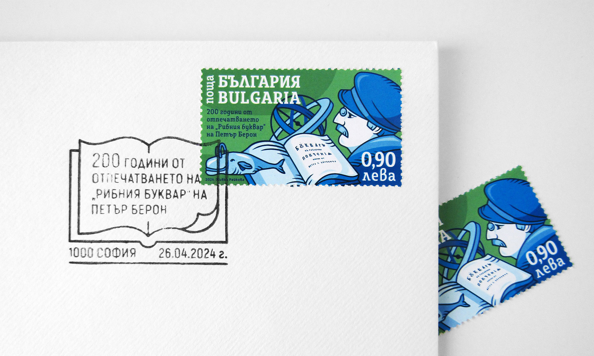
In 2024, Bulgaria marked 200 years since the publication of “A Primer with Various Instructions”, which became known to generations as Dr. Petar Beron’s “Fish Primer”. To commemorate the anniversary, I took part in a competition to design a commemorative postage stamp and postmark, and one of the two concepts I submitted was selected for production.
The most interesting – and at the same time most challenging – part of the project was finding a contemporary visual language for a subject connected with books, education, and cultural memory. As a graphic designer, this was also my first professional encounter with such an unusual format.
A postage stamp is a remarkably small creative object. It has to tell a story, carry official information, and work equally well when viewed from a distance and up close. And that is without even going into its cultural and historical value, beyond its significance as a collectible: how many prominent Bulgarian artists have designed postage stamps, and how many subjects, events, anniversaries, and notable figures have been documented through this tiny format.
And so, to the project itself:
Case Study
Brief
To create a commemorative postage stamp and postmark marking 200 years since the publication of Dr. Petar Beron’s “Fish Primer”.
Concept
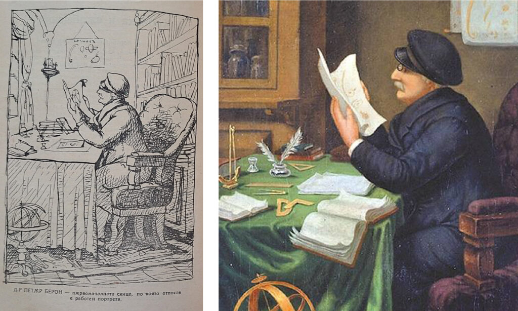
My main visual reference was the famous portrait of Dr. Petar Beron by Nikolay Pavlovich.
One fascinating thing I discovered during my research was that Pavlovich and Beron had actually worked together in Craiova, where, as early as 1858, the artist produced drawings and illustrations for Beron’s atlases. The well-known portrait was created in 1886, fifteen years after Dr. Beron’s death in 1871, and was based on sketches from earlier years, as Beron reportedly did not enjoy posing for portraits.
Another fact that struck me – especially from the perspective of a creative professional already in my mid-thirties – was that Dr. Beron was only 24 years old when the first Bulgarian primer was published.
I was also fascinated by the choice of verb used to demonstrate conjugation:
“Любя, любиш, люби…” – “I love, you love, he/she loves…”
To love – what better message could there be to pass on to young Bulgarian children?
For the composition, I incorporated the portrait of Petar Beron, an open book, the whale, and an armillary sphere – another term I encountered for the first time while working on this project.
From the outset, I wanted to keep the colour palette relatively restrained. I experimented with a triadic palette of violet and light orange, followed by a monochromatic blue version, before ultimately settling on a cool analogous colour scheme. To prevent the imagery from losing definition because of the closely related tonal values, I introduced a very dark blue outline.
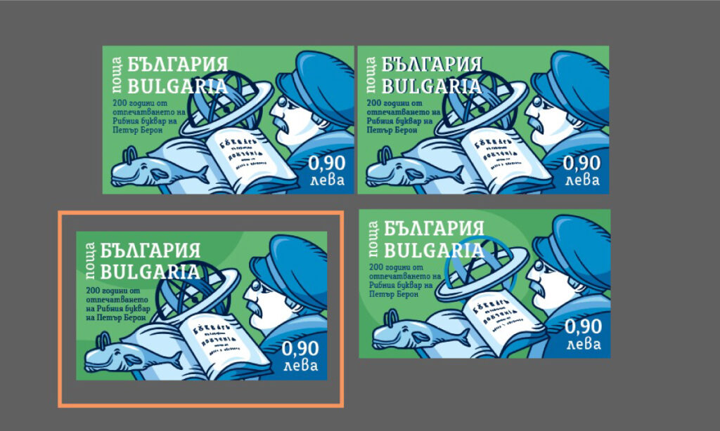
The illustration uses my favourite and preferred medium – vector graphics, with what I hope is a balanced degree of simplification and visual synthesis.
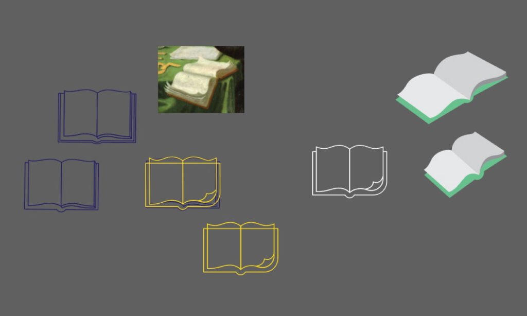
The postmark continues the concept through a simplified image of an open book, combined with the required text and official information. The shape is immediately recognisable and remains clearly legible when reproduced as a single-colour print.
Result
The project was selected in the competition and produced as an official commemorative philatelic issue.
For me, it was an opportunity to work simultaneously with a historical subject, illustration, typography, and a very specific set of technical constraints – all elements that turned the assignment into a valuable professional experience.
I should also add that I had the opportunity to meet some of the wonderful people who organised the competition and to visit them – after passing the necessary security checks – in an office with one of the best views in Sofia. There, I was able to explore an impressive collection of recent commemorative postage stamps and postmarks created by contemporary Bulgarian artists from across the country.
_________________________________________________________________
200 ГОДИНИ „РИБЕН БУКВАР“ – ПРОЕКТ ЗА ЮБИЛЕЙНА ПОЩЕНСКА МАРКА
През 2024 г. се навършиха 200 години от отпечатването на „Буквар с различни поучения“, останал в историята като „Рибния буквар“ на д-р Петър Берон. По този повод участвах в конкурс за създаване на юбилейна пощенска марка и пощенски печат, а едно от двете ми предложението ми бе избрано и реализирано.
Най-интересната и същевременно предизвикателна част от задачата беше да намеря съвременен визуален език за тема, свързана с историческа книга, образование и културна памет. Като графичен дизайнер този проект беше и първата ми професионална среща с този необичаен формат. Пощенската марка е много малък творчески обект, който едновременно разказва история, носи официална информация и би следвало да работи добре както гледан отдалеч, така и отблизо. Не искам да коментирам дори културната ѝ и историческа, а не само колекционерска, стойност – колко големи български художници са създавали проекти за пощенски марки, колко много теми, събития, юбилеи, личности са отразени в този мъничък формат.
И така, конкретно по самия проект:
Case study
Задача
Създаване на юбилейна пощенска марка и пощенски печат по повод 200 години от отпечатването на „Рибния буквар“ на д-р Петър Берон.
Концепция
Като основна референция използвах портретът на д-р Берон от Николай Павлович.
Любопитно за мен беше да науча това, че Павлович и Берон са работили заедно в Крайова, където художникът създава чертежи и илюстрации за атласите му още през 1858 г. А популярният портрет от 1886 г., е създаден 15 години след смъртта на д-р Берон през 1871 г, и то по скици от по-ранни години, тъй като Берон не е обичал да позира.
Друг интересен факт от гледната ми точка на творец, минал средата на 30-те, е че д-р Берон е бил само на 24 години, когато е отпечатан първият български буквар.
Очарователен е и изборът на глагола, които се показват спреженията:
“Любя, любиш, люби…” – да обичаш, какво по-хубаво от това, да предадеш като послание на българските дечица.

В композицията включих образа на Петър Берон, отворена книга, китът и Армиларната сфера (още един нов термин, които научих от проекта).
Още в началото не исках цветовата ми палитра да е твърде сложна, като опитах с триъгълна (triadic) във виолетово и светло оранжево, монохромна в синьо, и финално се спрях на студени съседни цветове (analogous). За да избегна липсата на дефиниране на изображенията при толкова близка тоналност добавих много тъмносин контур. Графиката е любимата ми и предпочитана векторна, с внимателно опростяване на образите.
Пощенският печат допълва основната темата чрез синтезирано изображение на отворена книга и задължителните надписи и пощенска информация. Спазих изсикването графиката да запазва четливостта си при едноцветен печат в малък размер.
Резултат
Проектът беше избран в конкурса и реализиран като юбилейно филателно издание. Предизвикателството да работя едновременно с историческа тема, илюстрация, типография и много конкретни технически ограничения превърнаха завършването на този проект в ценен професионален опит. Добавям и това, че имах възможността да се запозная с част от прекрасните организатори на конкурса, да ги посетя, макар и след проверка, в офиса с една от най-хубавите гледки в София и да разгледам чудесната колекция от актуални юбилейни пощенски марки и печати на съвременни български автори от цялата страна.
Resources:
https://bulgarianhistory.org/riben-bukvar-petar-beron/
https://en.wikipedia.org/wiki/Primer_with_Various_Instructions
https://bg.wikipedia.org/wiki/Петър_Берон_(просветител)

